
Untangle
motion print design visual system | Fall 2015
An advocacy campaign designed for the Carnegie Mellon University's Title IX Office with the goal of raising awareness about relationship violence, its signs and dangers, and how to seek help.
Approaching the topic
Our client was the Title IX office of Carnegie Mellon University, and the advocacy campaign was to be centered around the topic of Sexual Abuse and Relationship Violence. My goal was to focus especially on dating violence, to unpack the dangers and signs of abusive relationships, and to empower people in abusive relationships to protect themselves. The tone of my project would be empowering, empathetic and positive, yet without undermining the seriousness of the subject. Thus my target audience was people who are still in abusive relationships.
Concept development
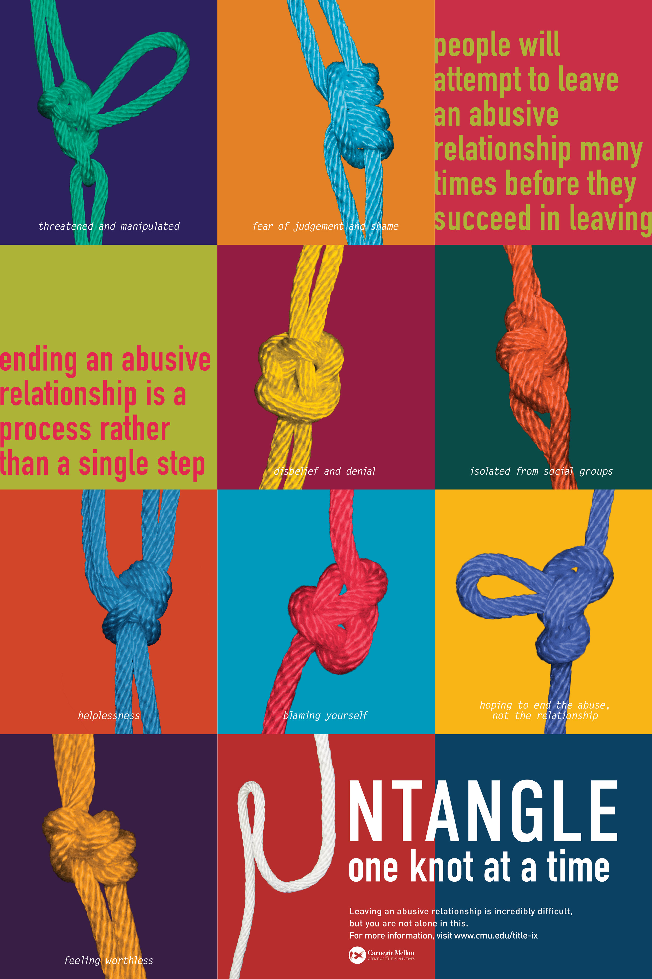
As I researched around the topic and read more stories from the survivors, I understood that there were a lot more complications and entanglements in leaving an abusive relationship than I had once considered. I was shocked at the statistics that on average, women would have attempted to leave an abusive relationship 7 times before they would leave for good. I learnt about the cycle of abuse, a process in which most victims go through before they succeeded in leaving. I had a mental picture of all these different knots entangling around victims as they attempt to leave the relationship, and decided to use knots as a visual metaphor of the physical and psychological entanglements involved in such situations. I wanted to empower the audience to persevere in ending abusive relationships, one step at a time, even if it is an incredibly difficult and long process.

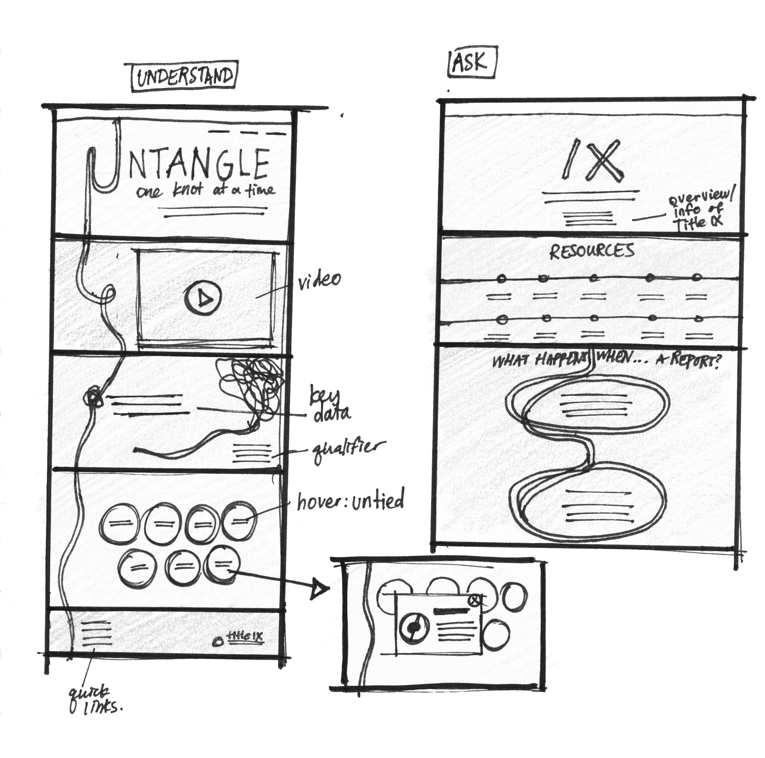
Motion piece
This short video piece unpacks the possible thinking behind each of the obstacles through a series of handwritten quotes from sources I collected, and encourages each with an alternate empowering message.
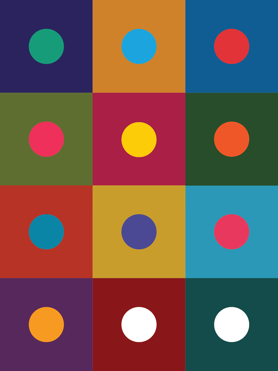
Print piece
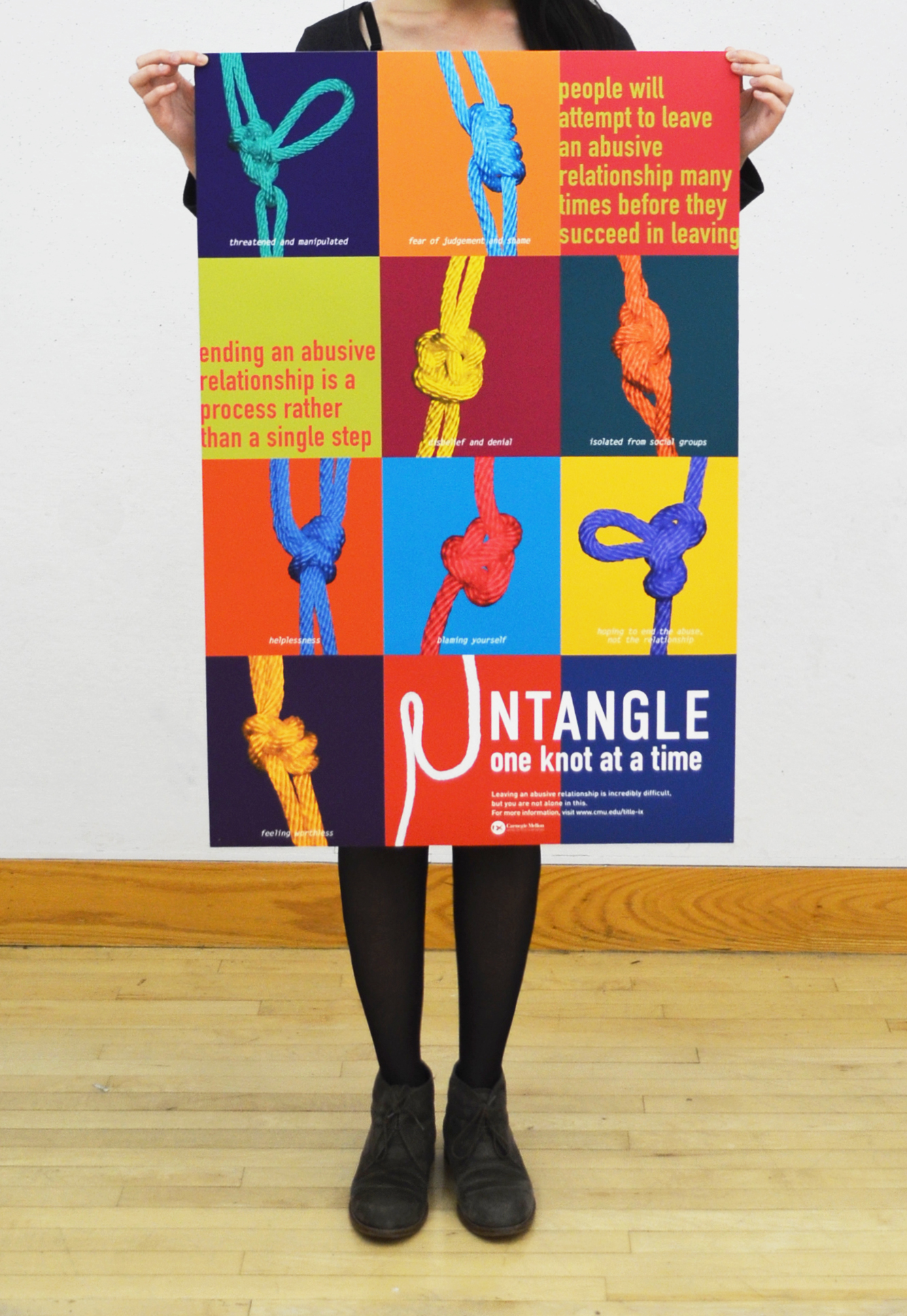
This 24” by 36” poster employs a grid system of 12 squares displaying the different knots, which represent the different obstacles in the process of leaving an abusive relationship. The two-color palette with simultaneous contrast for each square creates a pop art effect, which complements the grid layout.
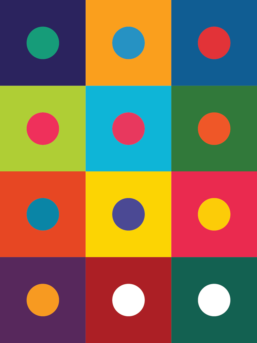

Final color palette
Color and typographic studies
The bright complementary color combinations could make my communication pieces too cheerful, which was inappropriate for the subject. Color contrast is the essence of my composition, however, and in order to retain the pop art effect, multiple colors in simultaneous contrast are necessary. To get the colors eye-catching, yet serious and sensitive to the subject matter, I did a series of color tests, decreased the saturation for a lot of the combinations, and was very careful in the juxtaposition of warm and cool colors.
After many typographic explorations, I arrived at a font pairing of Din Condensed Bold and Letter Gothic Italic. The monotype spacing of Letter Gothic evokes a sterile, passive-aggressive, slightly forlorn feeling in my opinion, which I believe conveys the subject very well in this case.